Israeli Ministry of Health Data Proves the COVID Shots Are Killing People

In March 2023, MIT Professor Retsef Levi disclosed a troubling figure produced by the Israeli Ministry of Health. This is unassailable proof the vaccines are killing people. Nobody noticed.
Executive summary
- Vaccines are unquestionably killing people. The Israeli Ministry of Health data confirms this. However, on March 7, 2023, MIT Professor Retsef Levi tweeted the data for the first time. It didn’t make a difference.
- Simply put, the medical community and health authorities are inept, corrupt, or both. Figure 2 does not allow for a 9X variation. That’s insane. Any rational person would have demanded an immediate halt to the vaccine program. How did everyone in conventional medicine miss this?
- Your risk of death increases monotonically from the time you receive the shot, peaking around 3 to 4 months after shot #2. Other doses simply climb and then plateau.
- Because the slope of the mortality risk curve is opposite to what doctors expect (you are more likely to die later rather than sooner), doctors fail to associate a death with the vaccine injection. This allows the vaccine to remain undetected under the radar.
- With each shot, your risk of death increases exponentially. For example, if your risk of death increased by 5% after shot #1, it could increase by another 6% after shot #2, another 9% after shot #3, 18% after shot #4, 50% after shot #5, and so on. Every time, it’s like shooting yourself with poison. This explains why excess deaths continue to rise worldwide, despite a decline in booster adoption.
- Lot variation exists. Some lots kill 30 times more people per dose than others. How can that be with a safe vaccine? This alone should be enough to put an end to the “safe and effective” narrative.
- The healthy vaccine temporal effect is complete nonsense, and it was invented to explain the data. The Israeli data shown below proves it unequivocally. If HVE exists, it should be an exponentially decaying effect, similar to a capacitor’s charge curve.
- Because of the lack of transparency in record-level public health data, they can continue to kill people without being caught. Nobody pushing vaccines is advocating for data transparency in public health. This raises a big red flag. This is an indication of a corrupt and out-of-control government. And, no, you cannot obtain this information through FOIA. That has never been done before, anywhere. It’s all over once this data is made public.
If the government wants to immediately stop all COVID vaccine misinformation, the solution is to release the data, as I previously discussed. Why aren’t they doing this? Answer: Joe Biden would then have to hold himself accountable for all Americans killed while he was in charge of pushing the jabs.
There is not a single pro-vaccine advocate who advocates for data transparency in public health. No vaccine manufacturer is also calling for it. If the vaccines truly worked, the drug companies would have required states to release public health data so that they could demonstrate how effective the product is and prevent misinformation superspreaders like me from gaining traction with the public. Instead, they appear to want all data to be hidden for at least 75 years. What is the public interest in that? Doesn’t that tell you everything you need to know?
About the MoH data
I’m confident that the MoH data was not fabricated because I’ve compared it to other data from which I know the provenance and it matches (for example, the death rate on shot 2 peaks at around 100 days and is roughly twice the minimum death rate). Also, if they hacked the data, they wouldn’t hide it behind a firewall; instead, they’d make it public.
It is no longer behind a firewall and can be accessed here.
MoH data proves the vaccines are killing people
On March 9, 2023, I published this data in my article: New Israeli MoH study shows COVID vax increases your risk of death over time.
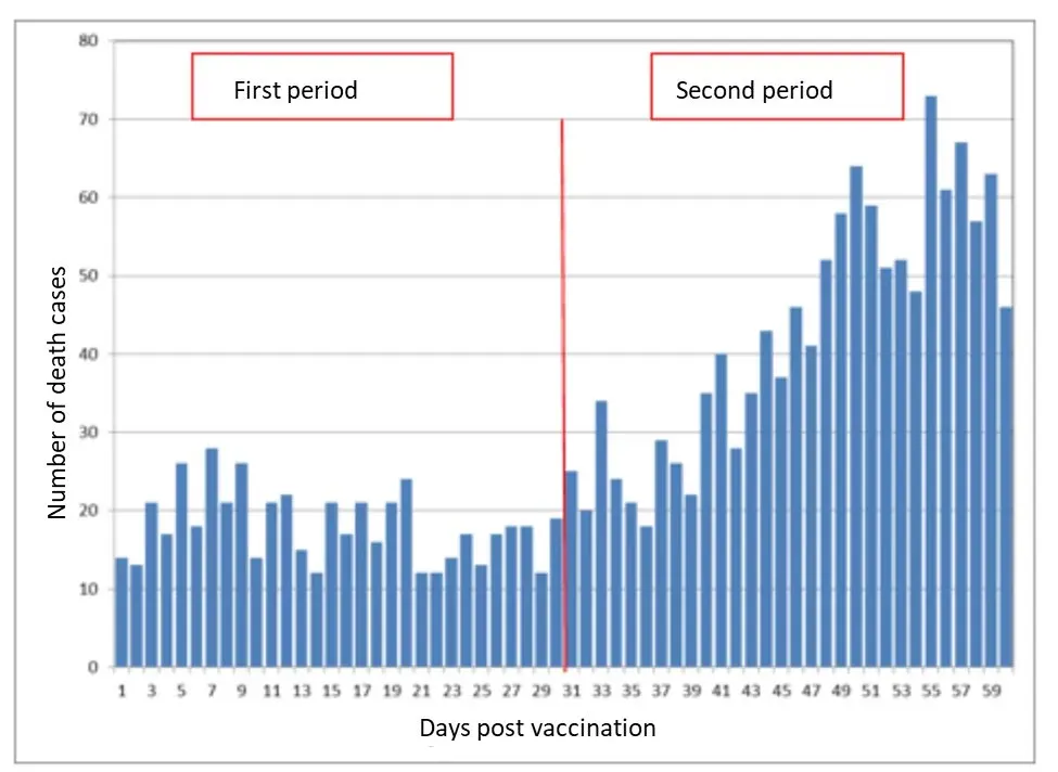
Here are the two most important graphs from that article. If your most recent shot is shot #2, both are day till death:

Figure 1. The death rate 60 days out is twice that of the first 30 days. All of these bars should be the same height for a safe vaccine. There is no such thing as temporal HVE; if there were, the first bar would be the lowest. On March 7, 2023, MIT Professor Retsef Levi made the data public for the first time.

Figure 2 is a diagram. This is a more detailed version of Fig. 1. After shot #2, your risk of death peaks around 100 days (3 months) later. If this was a safe vaccine, all of the bars on this graph would be the SAME height. This is an absolute train wreck. There’s a 9X variant here. The medical community is clueless. This is a signal to stop.
Figure 2 is a train wreck
A safe vaccine cannot have a 9X variation in bar height. Sorry. There is no way.
The medical community is oblivious to this. This is despicable.
Figure 2 screams, “I am killing people!” “Please stop me.”
Except for me, everyone else is looking the other way. AFAIK, I’m the only guy in the world who is pointing this out. This is unequivocal.
Attempts to gaslight people
People tried to explain Fig. 2 by saying things like:
The mythical healthy vaccinee effect, also known as HVE (temporal type).
Seasonality (in the winter, older people die at a much higher rate)
These explanations do not correspond to the data:
HVE is equal to zero. If HVE existed, the first bar would be lower than all others. However, as shown by the MoH data, the bars touch the lowest point several times in the first 30 days.
As we can see above, seasonality does not cause death to double in 30 days. And seasonality never exceeds a 2x difference.
To compare, here’s Dose 2 from another fully reported source, which shows how the death rate varies by month:

Diagram 3. Looking at another source’s comparable Dose 2 death curve, we see the same peak 3 to 4 months after the shot. For the time being, the scale on the y-axis has been intentionally obscured.
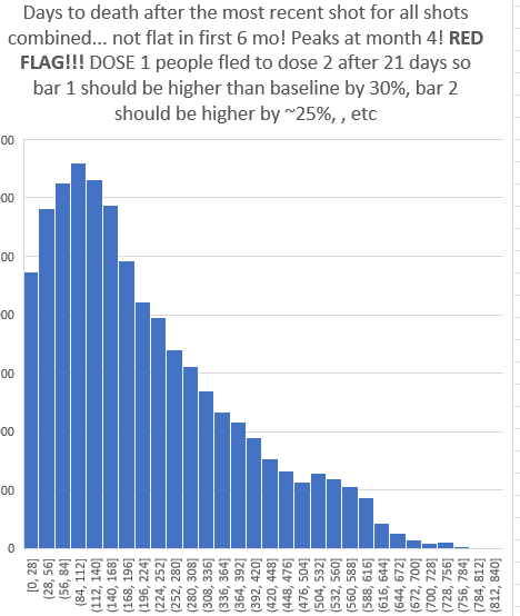
And here’s what happens when you combine all of the days to death since the most recent shot into a single graph:

Days until death as a result of the most recent shot. For a safe vaccine, the first bar should be 25% or higher, and the other bars should be about even for the first 6 months. This vaccine is not safe.
The issue here is that people only spend three weeks on Dose #1 before moving on to Dose #2, so the first bar above should have the most deaths, about 25% more than the other five bars after it. This is a major issue.
Impact on SCCS studies such as the one done by Joe Ladapo in Florida
Unless the logic is reversed, self-controlled case series methods (SCCS) used to detect excess mortality will not work for the COVID vaccine.
Most interventions have side effects that occur immediately after the intervention and then disappear. It’s the other way around for COVID vaccines.
So, according to conventional SCCS logic, the COVID vaccine appears to save lives while actually killing them!
Why doctors aren’t noticing the deaths from the COVID vaccine and how it has been able to stay under the radar
Simple. Doctors anticipate that the majority of vaccine-related deaths will occur shortly after injection. It couldn’t have been the vaccine if you died 6 months later.
We now know that it is the opposite… that you are more likely to die 3-6 months after the shot than immediately after the shot.
This is why the COVID vaccine appears to be so “safe.” It’s because it kills slowly and crescendo-style. Doctors are unaware of the response curve (because it is concealed from them).
Lot variation: How bad is my batch?
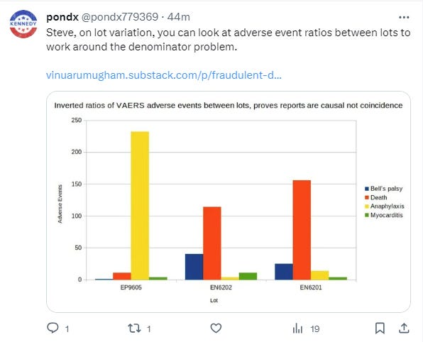
Previously, I never bothered with the “how bad is my batch” analysis because the denominator is hidden, making any conclusions vulnerable to criticism.
The denominator is kept secret to keep the public from learning the truth about how dangerous the product is.
If the vaccine is safe, the number of deaths per lot should be fairly consistent.
Drug manufacturers are aware that some batches are 30X or more lethal than others, but by not disclosing the number of vials injected into arms, they can keep the public in the dark about whether or not there is a safety signal. That is what they do.
I spent time on the How Bad is My Batch website after being prompted by some data I was given recently that showed a more than 30X disparity between batches. This is not an artifact, this is the real deal.
It only took 2 minutes. That location alone demonstrates massive excess mortality. You don’t require anything else.
Why isn’t the mainstream medical community demanding that the lot number, injection data, and mortality data be made public? Why isn’t there an op-ed in the New York Times about this?
How can this be explained? A saline shot cannot provide this level of variation. The profiles should be almost identical. These are not the same. The vaccine is dangerous.

The only reason not to disclose this is if you are attempting to murder people without being discovered.
Implications
Here’s a quick rundown of the most important things for people to know right now:
- This vaccine is unsafe and should be removed from the market immediately. People are dying as a result of the vaccine. There is no question about it. The only reason it’s still on the market is that we can’t get anyone with authority to examine the data. They are all unwilling to listen.
- Because the mortality risk is the opposite of what doctors expect (you are more likely to die later rather than sooner), doctors fail to link a death to the vaccine. This allows the vaccine to remain undetected under the radar.
- Your risk of death increases monotonically with each shot, peaking around 3 to 4 months after shot #2. Other doses simply climb and then plateau. We don’t have enough records to make a call on Dose #1 other than to note that it increases monotonically for the first three weeks and then we can’t tell without more complete record level data.
- With each shot, your risk of death increases exponentially. For example, if your risk of death increased by 5% after shot #1, it could increase by another 6% after shot #2, another 9% after shot #3, 18% after shot #4, 50% after shot #5, and so on. This explains why excess deaths continue to rise worldwide even as booster adoption falls, which we could never explain before!
- Lot variation exists. I was hesitant to make a call on this earlier because we didn’t know how many shots of each lot number were actually administered, but I’ve seen too much data from too many sources now that lead to the invariable conclusion that all lots are not alike and that there is likely a factor of 30X or more variation in deaths per dose for hot lots vs. cold lots. That is incredible. There is literally no clinical outcome quality control on these shots (they only look at things that do not determine clinical outcomes). They even conceal data on lot numbers and deaths from the general public. There is no possible justification for not publishing the number of injections and deaths for each lot number. It’s all over if they do this one thing.
- There is no healthy vaccinee effect (HVE) over time. If they say that, they are deceiving you. The Israeli data demonstrate that if there is an effect, it is not measurable. It’s essentially 0. Undetectable.
- We wouldn’t have to guess about any of this if we had a full dump of record level data. However, we have discovered why no one wants to release the data. They don’t even want to know who they are. Peter Baldridge just sent a FOIA request to the California Department of Public Health for their analysis of the data, as we’ve done above, at my request, and I’m almost certain they’ve done nothing.
- We already know that vaccines are causing a large number of unnecessary deaths. The only unanswered question is how bad it really is. Nobody wants to release the raw data so we can figure it out. That’s probably how they prefer it.
The lack of data transparency of public health is literally killing people
If the public ever learns about the record-breaking data, the vaccines are doomed. This is why every public health authority in the world keeps these secrets. Otherwise, not only are the COVID vaccines doomed, but so are many other vaccines, if not all of them.
We need legislation to address this issue.
I have yet to find a single legislator who is interested in forcing public health agencies to make public health data public. No one is returning my calls. They are all ignoring me.
But, with your help, I will not give up.
The good news is that things are about to change. Finally. I won’t say where this is taking place, but you’ll find out soon enough. It appears that drug companies do not have complete control over everything.
Reader comment noting the consistency with Pfizer trial
One of your very best posts, truly EXCELLENT. It’s also worth noting that the delayed mortality effect you mention is nearly identical to the Pfizer and Moderna gold-standard randomized clinical trial data. Both the Pfizer and Moderna clinical trials revealed that almost all excess vaccine-related deaths are postponed by at least a few months. Things appeared to be “fine” within the first month, with almost no excess vaccine deaths observed in the trials. However, after 6 months, the Pfizer and Moderna trials found that vaccination resulted in 45% more cardiovascular deaths and 16% more non-COVID deaths overall when compared to placebo (a net effect of “4 killed for every 3 saved”).
Good news: I found two chinks in their armor
There are always cracks, and I eventually discovered two small ones that they didn’t cover.
Or, more accurately, they both found me to be more accurate.
Keep an eye out. This could be significant. Very large.
Summary
On March 7, 2023, MIT Professor Retsef Levi tweeted the Israeli MoH data for the first time. It didn’t matter because the MoH duped people into thinking it was normal. Nobody seemed to notice.
But now that I’ve gathered enough data from various sources, I know they were lying about their interpretation. The HVE effect does not exist. Professor Levi’s graph is the real deal, and it’s impossible to explain if vaccines aren’t killing people.
I can now persuade any data scientist in the world that vaccines are lethal.
Unfortunately, no health authority on the planet will examine the data, even if it comes from “gold standard” sources. They’re not interested in learning. It makes no difference how strong the signal is, how reliable the data is, or how much evidence we have. It makes no difference. They are unwilling to look.
So none of this matters right now. We can’t make them see things they don’t want to see.
I’ll keep trying, and I’m confident that in less than a year, everything will be different.
Please support my work in the meantime.
Thank you very much.


