Interior designers share 6 of the best and 4 of the worst ways to use extra space in your home
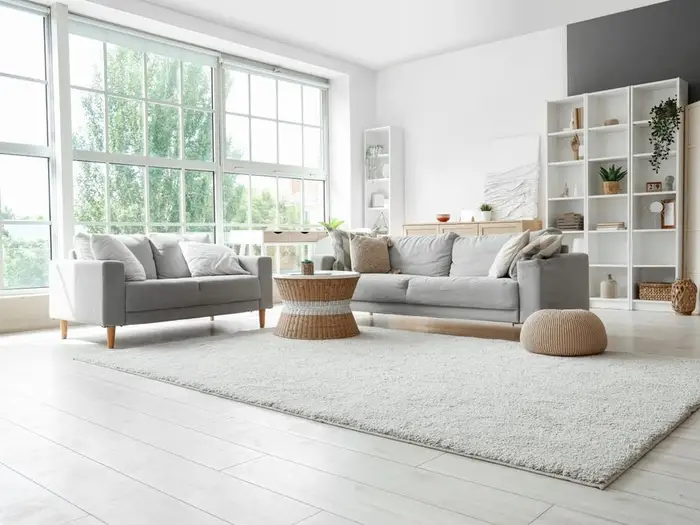
There are some things to avoid when you design your space to fit your needs.
Whether you rent an apartment or own a home, it’s essential to consider how your design choices allow you to make the most efficient use of your space.
B-17 asked interior designers for tips on the best and worst ways to take advantage of extra space in your home.
Declutter your closet by efficiently storing clothes you don’t need
Mark Cutler, an interior designer at Cutler Schulze, told B-17 that he recommends separately storing clothing you don’t regularly wear instead of filling your closet with clutter.
“Just because you have a large closet, it does not mean you have to fill it or occasionally purge,” Culter said. “Having all that extra space means you should be able to space out your wardrobe.”
He suggested using vacuum bags that can fit under the bed since they’re protective and easy to tuck away.
Book lovers should consider adding a bookshelf
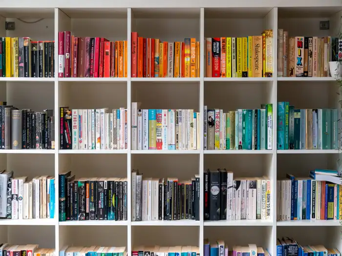
You can also use bookshelves to store miscellaneous items.
Different people have specific needs for their space, so avid readers may require a place to efficiently store more books, according to Betty Brandolino, founder and creative director of Fresh Twist Studio.
“Bookshelves can add extra storage space by incorporating lower cabinets, and we utilize baskets as hidden storage on a bookshelf,” Brandolino said. “Styling bookshelves is an art. We love to style bookshelves with decor items, baskets, picture frames, and, of course, books. It’s all about scale, color, and texture.”
She added that you can add wallpaper to the back of the bookcase for “extra definition.”
Turn the extra floor space near your bedroom window into a meditation nook
Primary suites may feel like they have a lot of extra space for more shelving and furniture, but Amanda Oninski, an interior designer at FLOOR360, instead suggested creating a meditation area with a rug.
“The area rug can be selected to match the rest of the decor and custom cut to fit the designated space,” she said. “The area rug serves as the floor cushion to relax.”
Oninski also recommended setting up window treatments to adjust the lighting and set a soothing mood.
Put the space under your stairs to work
Interior designer Brenna Morgan told B-17 that extra space under the stairs is the best place for added storage, but it’s often forgotten.
“I have seen drawers and cabinets installed. I have seen it hollowed out to allow for a dog house. I have seen it used for wine storage,” Morgan said. “People typically avoid using it because it isn’t a ‘walk-in’ space and has awkward angles.”
Morgan advised working with the odd shapes and angles of the stairs to best incorporate extra storage.
Add visual interest that isn’t furniture to your space
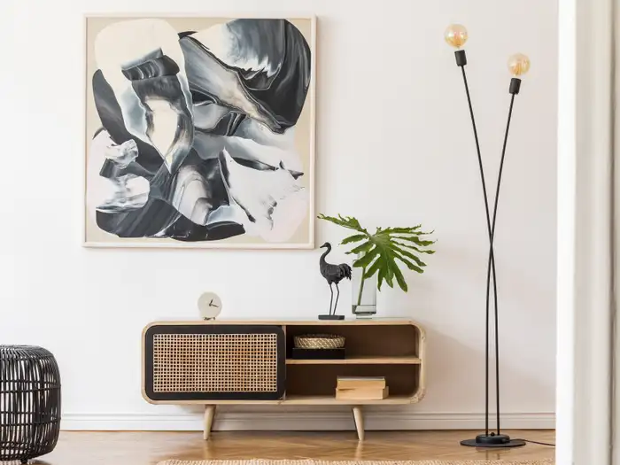
You can elevate a space with art.
According to Charli Hantman, owner of August Black Interior Design, it can be tempting to fill your extra space with additional large pieces of furniture, but there are other options worth considering, like wall art and sculptures.
“Extra space doesn’t necessarily have to be filled corner to corner. It’s nice to have a variety of things to look at to create depth and visual interest,” Hantman said. “I love finding art and wall sculptures that work together but have their own personality.”
Gallery walls are a stylish and eclectic way to bring unique pieces to a room.
You can add seating to unused corners
Mona Ying Reeves, founder of Re:modern, told B-17 that people should consider transforming extra corners into “casual conversation spots” using the 90-degree rule.
“People tend to engage more when they sit perpendicular to each other rather than directly face-to-face,” Reeves said. “Add a pair of chairs or a small café table to entertaining spaces.”
On the other hand, defining extra space with permanent features can lower the resale value
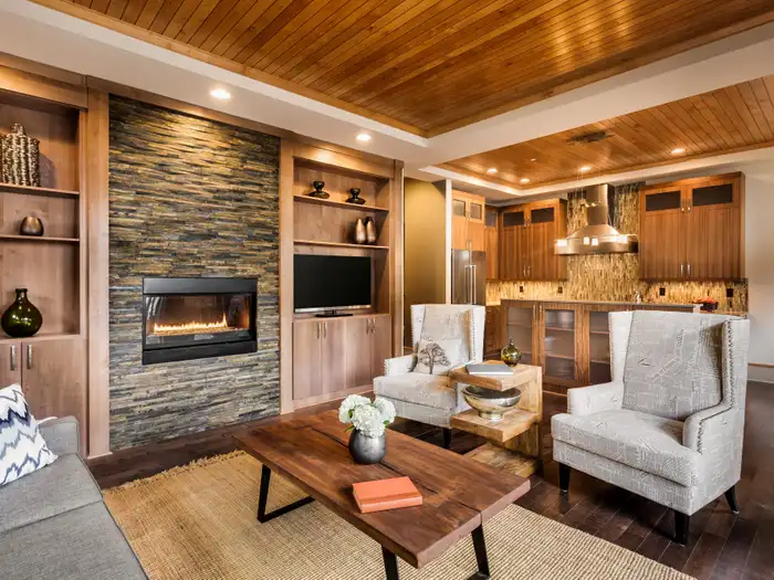
Built-in cabinetry is not very versatile.
Although it can be tempting to specifically define your space for your needs, Renee Croome, a designer at Northeast Kitchen and Flooring Center, advised against permanent furniture pieces.
“In a bonus room, I’ve seen a homeowner use cabinetry to build in a custom hobby or craft area,” she told B-17. “Although it was a beautiful space for crafting, the room didn’t have the same versatility it would have if they had simply used furniture pieces instead of built-in cabinetry.”
Croome added that a permanently customized space is “not always the best option for resale value,” so consider temporary or movable options.
Don’t add single chairs as filler
Hantman told B-17 one of her interior-design pet peeves is seeing single chairs placed in small, empty spaces without a purpose.
“A chair can be placed just for visual appeal, but it should be surrounded by some other element like a lamp or a side table, to create a ‘moment,'” Hantman said. “If it’s only going to clutter the space and doesn’t add any value to conversational seating, it will only make the space feel smaller and incohesive.”
The designer added that empty corners are OK since they allow the eye to focus on the more interesting pieces in the room.
Fake plants are never the way to go
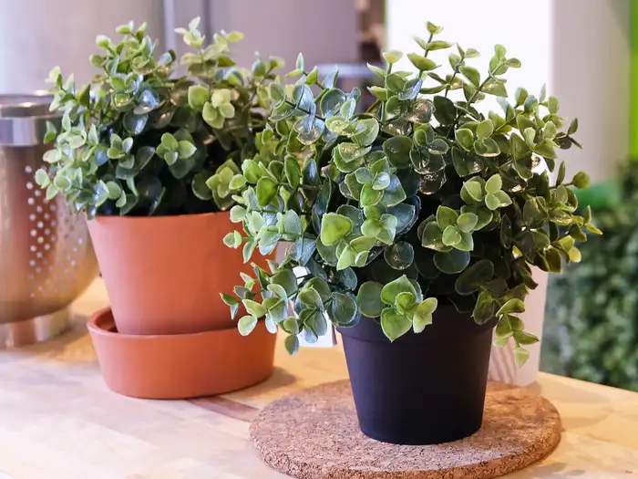
Fake plants still require maintenance.
Although fake plants conveniently add greenery to your room, interior designer Andra DelMonico, home-design writer for Trendey, said they’re not worth the space.
“You have a dead corner in your bedroom or living room and decide that it’s the perfect place for a potted plant. The worst thing you can do is place a fake one instead of a real, living plant,” DelMonico said. “A fake plant looks fake, no matter how ‘realistic’ it is.”
She added that you still have to dust the leaves of fake shrubbery without getting any aesthetic benefits real plants provide.
Don’t use your empty space without some sort of plan
Heather McKeown of Land and Sky Designs told B-17 that “one of the worst ways to go about using extra space is to be a man without a plan.”
“A room without a sense of purpose or organization is like a lost ship at sea, floating aimlessly in the waves waiting for a storm to hit,” McKeown explained. “In this scenario, you are the storm, and the chaos of disorder is that lack of direction.”
Without a clear vision, rooms can become a cluttered, stressful mess, according to the design pro.


